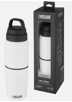
My product decision
-Products: notebook with a stylus pen, a box of sweets/chocolates with different flavours inside, drinkware/thermos mugs/ cups/ travel mugs
-Marginal or minority target audience: tourists
-Ideas for a name:
I have decided to pick a travel thermos cup because it is good for tourists who prefer to drink tea, coffee, and other hot/cold drinks, is it reusable, and stainless steel.
Brands, Logos, Slogans
1. Brand- a product, service, or concept that is publicly distinguished from other products, services, or concepts so that it can be easily communicated and usually marketed.
Logo- a graphic representation or symbol of a company name, trademark, or abbreviation, often uniquely designed for ready recognition.
Slogan- a short, easily remembered phrase used by an organisation so that people recognise it or its products.
2. 4 logos that I like
3. Which logo do you think is most successful? Why?
I think that the BMW logo is the most successful because the meaning of the BMW logo is its colours: white and blue are the colours of the State of Bavaria in Germany.
And I also think that the Nike logo is successful as well because it's just the name of the brand and its logo together and this simple design is more likely to be remembered and recognised than a complex one.
4. Find 2 examples of logos that you think are not good designs. And why?
This logo has bright colours and you can't really read and understand the text and the meaning of the logo.
Print Advertising
1. Describe the advert:
1. How has it been made (e.g. original photography, collage etc.)?
2. What images have been used in the advert?
3. How have they been treated/enhanced?
4. What colours have been used?
1. Original photography
2. Images of food have been used.
3.
4. Red, white, green, yellow
1. Printed2. An image of a Coca-Cola bottle is used.3.
4. Black, white, grey
1. Original images, printed2. Images of apartments are used.
3.
4. Dark blue, green, white, grey
1. Printed images 2. Images of food and drink are used.
3.
4. White, red, yellow, black
2. Images of the "Lipton" logo are used.
3.
4. White, yellow
2. Placement of advert:
1. Where is this placed (magazine/poster/POS)?
2. Is it part of a series?
1. Magazine
2.
1. Newspaper
2.
1. Brochure
2.
1. Billboard 2.
3. What does the text say?
How is it crafted to create a consistent message about the advert?
1. If there's a headline, how does it grab our attention?
2. What does the main text tell us specifically about the use of the product or service?
3. Does the ad prefer to sell the reader on the product's lifestyle benefits instead (e.g. telling you how amazing you are if you use the product for example)? How does the text relate to the images?
1. The headline 'Healthy Eating' grabs our attention and makes us eat more healthy food. Another headline is "If you keep good food in your fridge, you will eat good food". It means to keep more healthy meals and snacks whenever a crazy craving hits.
2. The main text tells us about healthy food and about food facts.
3. The ad is trying to tell us how it is good to eat healthy food as it is really good for your health. The text is about eating healthy food and so there are some images of food as well.
1. The headline "The contents of a bottle of Coca-Cola" grabs our attention by writing the "Coca Cola" in a big typestyle and interesting font. 2. The main text tells us to cut out the advertisement and present it to any bar, cafe, restaurant, grocery store or any place selling Coca-Cola.
3. The ad is to sell the reader the product and to make the reader taste the bottled Coca-Cola.
1. The headline "Apartment living" grabs our attention by telling us that they have an apartment that they are selling.2. The main text tells us that this apartment is available to buy.3. The ad recommends a choice of buying an apartment if this is what the reader is looking for.
1. The headline "more whoa, less dough" grabs our attention to make the reader surprised or excited and like to say that there is "less dough". 2. The main text tells us that there is a McDonald's fast food restaurant.
3. The ad is trying to tell us that it is not that far and you can walk or drive through there.
1. The headline "Lipton" grabs our attention with its big logo and also by its bright yellow colour.2. The main text tells us that they sell Lipton drinks.
3. The ad is trying to tell us that you can get a nice and tasty drink, Lipton.
4. What does the image say?
1. How does the photograph/illustration grab our attention?
2. Is a picture depicting the product by itself or being used by someone? Does a photograph show us a lifestyle associated with the product
3. How do the images relate to the text?
1. They put a large photograph to grab our attention.
2. It shows us a lifestyle of eating more healthy food.
3. The text is about different types of healthy food and facts about food.
1. The picture of the Coca-Cola bottle grabs our attention to make us more interested in the product and to make to buy and try it. 2. It shows us the advertisement of CocaCola.
3. The text is about Coca-Cola and that it should be advertised in different shops.
1. They put lots of images of the rooms to grab our attention. 2. It shows us more information about what they are selling in these rooms and apartments
3. The text is about the fact that there is more about the apartment and that they are quite good apartments.
1. There are images of food and drink to grab our attention.
2. It shows us that there is a McDonald's not that far.
3. The text is about to attract the reader who saw that billboard.
1. There are images of the "Lipton" brand. 2. It shows us that there is a small kiosk inside the building.
3. The text is about how they sell Lipton drinks.
5. Who is the target market of the magazine/newspaper/billboard etc.?
1. Would someone from a different demographic than you: (different gender, older, younger, someone who had more or less money than you, someone with different political values, or a different race) interpret the text and imagery differently?
2. What values does the advert contain? Is it young hip, mature, playful, or exciting?
1. To eat healthy food is for both genders, older, and younger, and for someone who has more money they could buy more food because it's good to eat healthy food, but for someone who has less money might not be able to buy more healthy food.
2. It is mature and exciting at the same time as they are trying to tell that healthy food supports your good body feeling.
1. The imagery of the text and image for the younger generation will reflect well on them as almost every one of them drinks Coca-Cola. 2. They did it exciting and good for everyone by putting some more information about Coca-Cola, the image of the bottled Coca-Cola, and the big circled line on the whole page of the newspaper.
1. Buying an apartment is more for someone who is older and has more money so the reader can afford it. 2. They did it more mature for the older generation as they are more interested in buying an apartment.
1. Buying food from McDonald's is for the older and younger generations, but not almost everyone can afford it depending on their reasons. 2. They made it more exciting by putting this huge billboard outside so everyone is going to see that advertisement.
1. Buying drinks from Lipton is for both genders and the same just like for older and younger generations, but everyone who wants to buy and try it can. 2. They made it exciting by having this small kiosk in a building, but in such a bright yellow colour so it will be easier to notice.
6. Evaluate the
Advertisement(s)
1. How effective is it in your opinion? If it is effective, why?
2. How would you change it?
3. Describe an idea for a follow-up advert
1. It is effective by putting some nice images of different healthy foods.
2. I wouldn't change it.
3.
1. It is effective by having a big size type style of the title "Coca-Cola" and the circled line around the text which makes it look more interesting.
2. I would change the colour from black and white to bright colours such as white, red, and black so it's going to attract the reader by its vivid and colourful colours.
3.
1. It is effective by combining 2 colours which are dark blue and light green and it makes it more interesting for the reader.
2. I wouldn't change it.
3.
1. It is effective because of the bright red background, which attracts more attention to the reader.
2. I wouldn't change it.
3.
1. It is effective because of the bright yellow background, which attracts more attention to the reader. 2. I wouldn't change it.
3.
Packaging research
3 product packaging related to my product/theme
Describe the purpose and suitability of the packaging of the product.
-The purpose of the packaging of the product is to protect the product from damage, heat and other external factors during transportation, handling and storage.
Include one option that includes sustainable materials.
-Recycled cardboard materials.
Describe what sustainable materials are and how they can be used for packaging.
-The materials that can be used are baking paper, and fast food containers such as pizza, and beverage cups.
Describe the purpose and suitability of the packaging of the product.
-The purpose of the packaging of the product is to protect it from damage and identify and promote the product in a way that appeals to the potential purchaser.
Include one option that includes sustainable materials.
-Recycled paper.
Describe what sustainable materials are and how they can be used for packaging.
-The materials that can be used are recycled paper, tissue paper, paper plates, paper cups, milk cartons and paper bags.
Describe the purpose and suitability of the packaging of the product.
-The purpose of the packaging of the product is to protect the product from damage.
Include one option that includes sustainable materials.
-Recycled paper.
Describe what sustainable materials are and how they can be used for packaging.
-The materials that can be used are recycled paper, tissue paper, paper plates, paper cups, milk cartons and paper bags.
Name for my product:
1. Like Drinking
2. The Bottled
3. Drink/Drinks
4. Usual Drink
5. DrinkDrink
6. Drink&Drink
Logo/logotype for my product(to sketch some ideas and choose the best)
Conducting Primary and Secondary Research
1. The differences between Primary and Secondary research, advantages and disadvantages of each.
Primary research and secondary research both offer value in helping you gather information. Primary market research is original research carried out when a company needs timely, specific data about something that affects its success or potential longevity. Primary research data collection might be carried out in-house by a business analyst or market research team within the company, or it may be outsourced to a specialist provider, such as an agency or consultancy.
Secondary research is research that has already been done by someone else before your own research study. Secondary research is generally the best place to start any research project as it will reveal whether someone has already researched the same topic you’re interested in, or a similar topic that helps lay some of the groundwork for your research project.
reference: https://www.qualtrics.com/experience-management/research/primary-vs-secondary-research/
Advantages of Primary Research:
1. Targeted Issues are addressed
The organisation asking for the research has complete control of the process and the research is streamlined as far as its objectives and scope are concerned. Researching companies can be asked to concentrate their efforts on finding data regarding specific markets rather than concentrating on the mass market.
2. Data interpretation is better
The collected data can be examined and interpreted by marketers depending on their needs rather than relying on the interpretation made by collectors of secondary data.
3. Recency of Data
Usually, secondary data is not so recent and it may not be specific to the place or situation the marketer is targeting. The researcher can use the irrelevant information to know trends or may be able to find some relation with the current scenario. Thus primary data becomes a more accurate tool since we can use data that is useful for us.
Disadvantages of Primary Research:
1. High Cost
Collecting data using primary research is a costly proposition as the marketer has to be involved throughout and has to design everything.
2. Time Consuming
Because of the exhaustive nature of the exercise, the time required to do research accurately is very long as compared to secondary data, which can be collected in a much shorter time duration.
3. Inaccurate Feedback
In case the research involves taking feedback from the targeted audience, there are high chance that the feedback given is not correct. Feedback by its basic nature is usually biased or given just for the sake of it.
reference: https://www.ianswer4u.com/2012/02/primary-research-advantages-and.html
Advantages of Secondary Research:
1. Ease to access
The secondary data sources are very easy to access. The Internet has changed the way secondary research works. Nowadays, you have so much information available just by clicking with the mouse.
2. Low-cost or free
The majority of secondary sources are absolutely free for use or at very low costs. It saves not only your money but your efforts. In comparison with primary research where you have to design and conduct a whole primary study process from the beginning, secondary research allows you to gather data without having to put any money on the table.
3. Time saving
As the above advantage suggests, you can perform secondary research in no time. Sometimes it is a matter of a few Google searches to find a source of data.
Disadvantages of Secondary Research
1. Might be not specific to your needs
Secondary data is not specific to the researcher’s needs because it was collected in the past for another reason. That is why the secondary data might be unreliable for your current needs. Secondary data sources can give you a huge amount of information, but quantity does not always mean appropriateness.
2. You have no control over data quality
The secondary data might lack quality. The source of the information may be questionable, especially when you gather the data via the Internet. As you rely on secondary data for your data-driven decision-making, you must evaluate the reliability of the information by finding out how the information was collected and analysed.
3. You are not the owner of the information
Generally, secondary data is not collected specifically for your company. Instead, it is available to many companies and people either for free or for a small fee. So, this is not exactly a “competitive advantage” for you. Your current and potential competitors also have access to the data.
reference: https://www.intellspot.com/secondary-data/
2. What do you think would you need to research to make an effective NEW media product?
3. Primary Research: what methods could you use for gathering relevant information.
Method 1: Experiment
When to use: To test a causal relationship.
How to collect data: Manipulate variables and measure their effects on others.
Method 2: Survey
When to use: To understand the general characteristics or opinions of a group of people.
How to collect data: Distribute a list of questions to a sample online, in person, or over the phone.
Method 3: Interview/focus group
When to use: To gain an in-depth understanding of perceptions or opinions on a topic.
How to collect data: Verbally ask participants open-ended questions in individual interviews or focus group discussions.
reference:https://www.scribbr.co.uk/research-methods/data-collection-guide/
4. Difference between quantitative and qualitative research.
1. Examples of questions for quantitative and qualitative answers.
-Because qualitative and quantitative studies collect different types of data, their data collection methods differ considerably. Quantitative studies rely on numerical or measurable data. In contrast, qualitative studies rely on personal accounts or documents that illustrate in detail how people think or respond within society.
reference: https://www.gcu.edu/blog/doctoral-journey/qualitative-vs-quantitative-research-whats-difference#h-what-is-the-difference-between-qualitative-vs-quantitative-research
2. How could you display the results of each? Give an example.
-Use visuals such as charts, diagrams and images whenever possible to make hard data more comprehensible. A picture tells a thousand words (or numbers). Provide a logical flow from quantitative to qualitative data so your audience can see how the numbers and interpretations are connected.
reference: https://www.clearpointstrategy.com/blog/qualitative-and-quantitative-data
5. 1. Secondary research: Examples of what you could use as sources?
1. Examples of secondary research sources:
1. Textbooks
2. News articles
3. Dictionaries and encyclopedias
4. Journal articles that comment on or analyse research
5. Books that interpret, analyse
6. Biographies
7. Criticism of literature, artworks or music
reference: https://www.library.unsw.edu.au/using-the-library/information-resources/primary-and-secondary-sources
2. Why do you need to reference (give three reasons)?
-Sometimes secondary referencing is unavoidable as the original source may not be available, may be out of print, or written in another language. If this is the case, you need to:
- Cite both the original source and the source you've read which cites that idea or quote.
- Fully reference in your reference list only a source you have actually read, not the original source.
reference: https://libraryfaqs.worc.ac.uk/faq/138673#:~:text=Sometimes%20secondary%20referencing%20is%20unavoidable,cites%20that%20idea%20or%20quote
3. What is Harvard Referencing?
-The Harvard referencing system is known as the Author-Date style. It emphasises the name of the creator of a piece of information and the date of publication, with the list of references in alphabetical order at the end of your paper.
reference: https://libguides.mjc.edu/c.php?g=255746&p=3205500#:~:text=Harvard%20Style-,What%20is%20Harvard%20Style%3F,the%20end%20of%20your%20paper.
6. 1. What is a tagline in terms of research?
-A tagline is usually a short phrase that accompanies a brand's logo or wordmark that sums up or reinforces the intended tone of a brand. It is used as a shorthand way of conveying the most important aspects of a brand to a consumer quickly and effectively.
reference:https://kpu.pressbooks.pub/openimc/chapter/tagline/#:~:text=A%20tagline%20is%20usually%20a,a%20consumer%20quickly%20and%20effectively.
2. Difference between a tagline and a slogan?
-Taglines and slogans are similar, but minor differences set them apart. Taglines are more permanent representations of your brand, while slogans can be changed frequently and are often particular to specific campaigns. Both taglines and slogans should be brief and representative of your brand.
reference: https://www.kickinitwithkapok.com/blog/the-difference-between-brand-taglines-and-slogans/#:~:text=Taglines%20and%20slogans%20are%20similar,and%20representative%20of%20your%20brand.
3. What makes a great tagline?
-A great tagline captures the essence of the value you provide to your customer in one or two concise sentences. Creating a tagline is a powerful exercise, as it forces you to think about exactly what it is you do for your customers that is unique.
-Of all the things marketers think make a good tagline, only three things actually influenced likability:
1. Clarity of message.
2. Creativity of phrasing.
3. Inclusion of benefits.
reference: https://www.forbes.com/sites/theyec/2014/06/18/how-to-craft-a-powerful-tagline-for-your-business/
reference: https://www.columnfivemedia.com/the-secrets-behind-a-great-tagline/
Packaging Mood Board
My logo:
Evaluation
What specific tools and techniques did you use to make a successful logo?
-I used Adobe Illustrator to do my logo. Type Tool to type text. The typestyle of the D is 'Castellar'. The typestyle of Drink&Drink and Keep it cool, keep it heated is 'Bernard MT Condensed'.
How have you planned your logo design?
-First, I did my sketch for my logo and then I tried to do it digitally.
What could you have done better if you had more time?
-To improve my logo and maybe change the typeface to a different one, change to another colour.
My packaging sketch
My package - Evaluation
The specific tools and techniques I used to make a successful packaging.
-I used Illustrator and Pen Tool to sketch the package.
-I used the Rectangle Tool to draw a shape. Then, Effect-->3D and Materials-->Extrude and Belev.
-I rotated the shape so I could put the logo.
-I used Pen Tool to create paths with precision using anchor points and handles and fill them with the black colour.
-To add a logo I clicked on Properties-->3D and Materials-->Materials
-->Graphics.
-The hardest thing to do was to put the shape of the packaging in the right position, so it looked the same as my package sketch. I put my logo at the front of my package and at the top of my package.
What skills do you feel you need to develop further?
-
What could you have done better if you had more time?
-If I had more time I could do more kinds of packaging for different types of the product.
Product Research
1. What is your product?
-My product is a travel thermos cup.
2. How will you approach your research?
Here are some ideas of how I will approach my research:
-Define my research goals.
-Understand my customers.
-To do surveys on social media to hear my customer's opinions and thoughts.
3. Show some initial ideas
Some initial ideas are:
-To do market research for my product by looking at other designers and existing products and analysing the choices that have been made.
-Meeting consumer needs.
-Aid pricing strategies.
4. Create some initial Taglines
1. Keep it cool, keep it heated
2. Just drink it
3. Enjoy the drink
4. Gotta Sip It Up!
5. Go take a sip!
5. Plan any photography and include locations
Adobe Animate experiment
In this experiment I used the picture of the shine as a background and the picture of the Santa as an object. I used Free Transform Object to select an object, then Insert-->Create Motion Tween and then move an object to make it look like it's running and going up.
3 animated logos
Describe the animation
-The 3D Nike design is among the trippiest animated logo examples out there. The smooth switch between its two versions vividly animates the exact meaning behind the original Nike swoosh.
What is it for?
A simple design that illustrates motion and speed.
What is the imagery?
-
What colours are used?
-Neon gradients and colours such as purple, yellow, green, blue and pink.
Is there any type?
-
Is it clear what the logo is for?
-It is clear what the logo is for.
Is it interesting?
-It is interesting.
How long does it last?
-12 seconds
What do you like most about it?
-The most I like about it is the gradient of neon colours.
Anything that could improve it?
-Nothing to improve on.
A picture of 2 or 3 stages
Web address-https://www.svgator.com/blog/animated-logo-examples/#3d-logo-animation-examples
https://youtu.be/3XfzA9KDF88
Describe the animation
- The logo’s design has seen a constant shift toward a minimalist look.
What is it for?
-It is to grab the customer's attention with its different and interesting animations.
What colours are used?
-Green, yellow, red, light blue, black, purple, white, grey, dark blue, pink.
Is there any type?
-
Is it clear what the logo is for?
-It is clear what the logo is for.
Is it interesting?
-It is very interesting.
How long does it last?
-1 minute and 10 seconds.
What do you like most about it?
-The most I like about it is that looks minimalistic and they use a lot of bright colours for their 3D logo.
Anything that could improve it?
-Nothing to improve on.
A picture of 2 or 3 stages
Web address-https://www.svgator.com/blog/animated-logo-examples/
Describe the animation
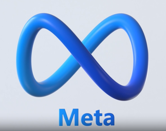
-The animated logo leaves behind the blocky wordmark Facebook users easily recognise. It introduces a vibrant blue gradient and a 3D continuous looping shape that resembles a ribbon with two-coiled ends. The logo symbol is meant to illustrate the “infinite horizons in the metaverse,” as the design team at Meta puts it.
What is it for?
-Posting stories
What colours are used?
-Blue and white
Is there any type?
-
Is it clear what the logo is for?
-It is clear what the logo is for.
Is it interesting?
-It is interesting
How long does it last?
-6 seconds
What do you like most about it?
-The shape of the logo.
Anything that could improve it?
-There is nothing to improve on.
A picture of 2 or 3 stages
Web address-https://www.svgator.com/blog/animated-logo-examples/
My animated logo:
Evaluation
What specific tools and techniques did you use to make a successful animation?
-In this experiment, I used Insert->New Symbol to make it a symbol. Insert->Create a Classic Tween to move the image around.
How would you improve the combination of logo and movement if you had more time?
-If I had more time I would add more interesting movements to the logo.
What is the most successful part of it?
-The most successful part of it is the slow movements of the logo.
Research on packaging designer or brand who has inspired my packaging design
1. The history/background and how they evolved over time.
What is the origin of the Stanley thermos?
-It was 1913 when William Stanley invented the all-steel, double-wall vacuum bottle and stuck his name on it. Rumor has it, that he wanted his coffee hot all day while he was working, and was inspired to apply some of his theories learned while developing transformers.
-The Stanley name has become synonymous with ultra-durable, super-reliable products made with an eye for sleek design and real-life uses. Generations of people have come to rely on their Stanley bottles, mugs, lunchboxes, cook sets, flasks, growlers, coolers, and more every single day, knowing that they’ll keep their food and drink at temperature longer, all while standing up to life’s wear and tear.
-To start out, you have to understand what makes a Stanley a Stanley. When William Stanley invented double-wall steel vacuum insulation all the way back in the Teeming Teens, he set the fundamental groundwork for the technology that would define the company’s reputation for unparalleled performance.
-At the time vacuum insulated bottles were lined with glass, and they did a fine job keeping coffee hot. That is until one of those suckers got damaged.” Glass in your cup of Joe may ruin your day, but in 1913, the equivalent of having to fork out $150-$200 for a new bottle could ruin your entire month or more.
2. Images/links
https://www.stanley1913.com/blogs/my-stanley/old-stanley-vs-new-stanley-whats-really-changed-in-the-unbreakable-bottle#:~:text=It%20was%201913%20when%20William,theories%20learned%20while%20developing%20transformers.
3. List the sources of your information
Copyright and image file types for web
Copyright is a type of intellectual property that gives the creator of an original work, or another owner of the right, the exclusive, legally secured right to copy, distribute, adapt, display and perform a creative work, usually for a limited time.
https://en.wikipedia.org/wiki/Copyright
You are free to:
- Share — copy and redistribute the material in any medium or format
- Adapt — remix, transform, and build upon the material
- The licensor cannot revoke these freedoms as long as you follow the license terms.
Under the following terms:
- 1. Attribution — You must give appropriate credit, provide a link to the license, and indicate if changes were made. You may do so in any reasonable manner, but not in any way that suggests the licensor endorses you or your use.
- 2. NonCommercial — You may not use the material for commercial purposes.
- 3. ShareAlike — If you remix, transform, or build upon the material, you must distribute your contributions under the same license as the original.
- No additional restrictions — You may not apply legal terms or technological measures that legally restrict others from doing anything the license permits.
Digital image files
1. Resolution - describes the sharpness, or clarity, of an image or picture. It is expressed in terms of the number of pixels that can be displayed both horizontally and vertically. Resolution is an important factor to measure the visual quality of digital images, photos and videos.
2. What images type files are most used for websites?
-JPG format is the standard file format of digital cameras and is the most common image format used on the web because of its compression and universal support.
-The JPEG image format is the most widely used lossy compression format for still images.
3. What are the differences between them?
Transparency
In a simple form, transparency indicates something completely invisible. Logos and icons often need to be placed on backgrounds with variable colours.
-JPEG
-JPEG images don't support transparency and are not usable for such cases.
-PNG
-PNG images support transparency in two ways - inserting an alpha channel that allows partial transparency or declaring a single colour as transparent (index transparency).
-GIF
-GIF images support transparency by declaring a single colour in the colour palette as transparent (index transparency). Because of an absence of partial transparency, the edges (specially rounded or too-detailed edges) get a poor jagged effect.
Colours
There is a significant difference in the number of colours that can be supported by these 3 formats.
-JPEG
-JPEG images can support around 16 million colours. This is what makes
them suitable for storing images of natural scenes.
-PNG
-PNG images mainly have two modes PNG8 and PNG24. PNG8 can support
up to 256 colours whereas PNG24 can handle up to 16 million colours like
a JPEG image. Use PNG8 for simple shapes with fewer colours and PNG24
for high-quality, complex logos and shapes with rounded corners on a
transparent background.
-GIF
-GIF images are limited to 256 colours. If index transparency is used then one of these 256 colours is assigned as transparent and the remaining 255 are used for other colours.
Animation
Animation, in this case, refers to any change or movement in the image. It doesn’t necessarily have to have frame rates like an animated video, but a part or the entire image changes with time.
Of these 3 formats, only GIF supports animation. This capability makes the GIF image format suitable for delivering engaging ads and banners. Of late, with the advent of companies like Tymblr, 9Gag, Giphy, etc. the use of GIF format for memes has picked up.
https://imagekit.io/blog/jpeg-vs-png-vs-gif-which-image-format-use/
Magazine Advertisement
The specific tools and techniques I used to make a successful magazine advertisement.
-For the background, I used the Rectangle Tool to select the whole page and Gradient to change the colour.
-I used File-->Place to put my product and logo picture.
-For the "Keep it cool, keep it heated" text I used Pen Tool to draw a curved line and then Type On Path Tool so I can write on the curved line. The typeface that I used for this text is Monotype Corsiva(Regular).
-For the text about my product, I used the Type Tool to add text. The typeface that I used for this text is Berlin Sans FB(Regular).
-For the headline I used Type Tool and the typeface for the text is Showcard Gothic(Regular).
Evaluation
In what way is your magazine advert suitable for your target audience and what style of message did you want to get across to them?-The way it is suitable for my target audience is that they get to know about my product and the message to get to them is to state the product's purpose to the customers.
How does your design appeal to your target audience: through the use of colours, typography, and positioning of logo and images?
-
How would you improve your magazine advert?
-
What is the most successful part of it?
-The most two successful parts of it and the things I like the most are the colourful background and the short and memorable headline.


.png)


.png)

.png)
.png)


Немає коментарів:
Дописати коментар